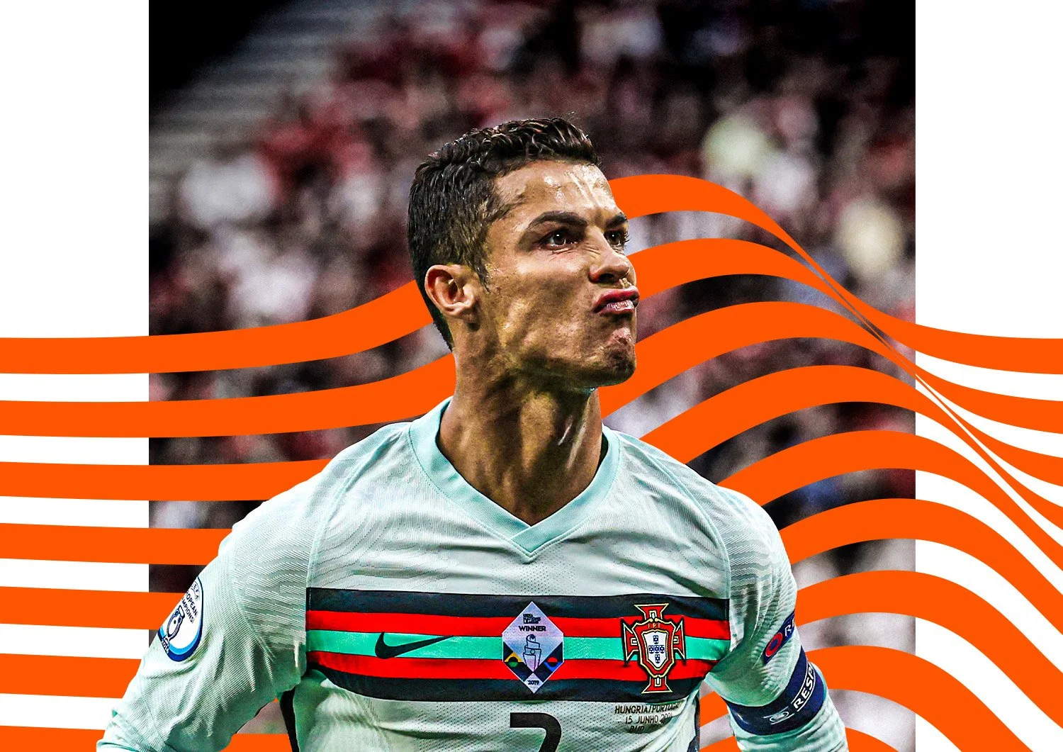


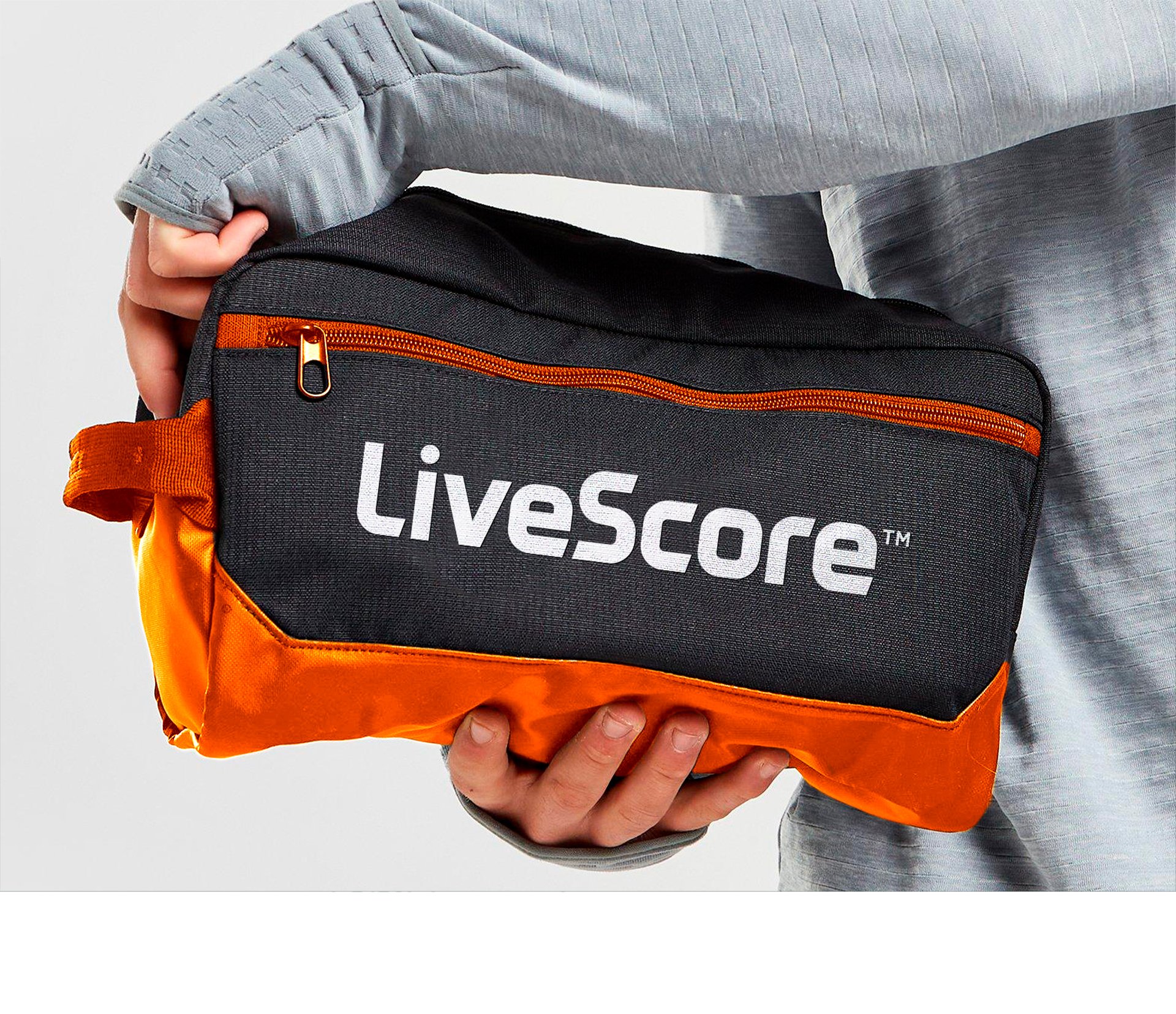
LiveScore
LIVESCORE : BRAND IDENTITY
LiveScore
LIVESCORE : BRAND IDENTITY
CHALLENGE
Develop a vibrant new identity for LiveScore that connects fans to their passions.
SOLUTION
A smart and sharp rebrand which brings to life LiveScore with no ego, just simplicity and the love of football at its core. The visual identity is centred around the ‘Momentum Shift’ which highlights the inspirational moments that get the fans out of their seats and into the air. The design system also delivers a visual analogy for the role the LiveScore brand plays – delivering real time action, stats and analysis, that have a direct and immediate impact on users.
EXECUTION
Design Director - From brief to rollout
Full rebrand
CHECK IT OUT


FIA World Rallycross: Projekt E
FIA – PROJEKT E : BRAND IDENTITY
FIA World Rallycross: Projekt E
FIA – PROJEKT E : BRAND IDENTITY
CHALLENGE
Create the brand identity for the FIA World Rallycross’ new electric support series Projekt E.
SOLUTION
Rallycross must adapt and evolve with the changing world. Projekt E was created to push the sport to the next level of innovation. The brand is an always moving, powerful and electrifying pulse - a leader in the future of motorsports.
EXECUTION
Design Director – From brief to final artwork
Art Direction – Photo shoot
Full branding
CHECK IT OUT

Projekt E launch teaser video


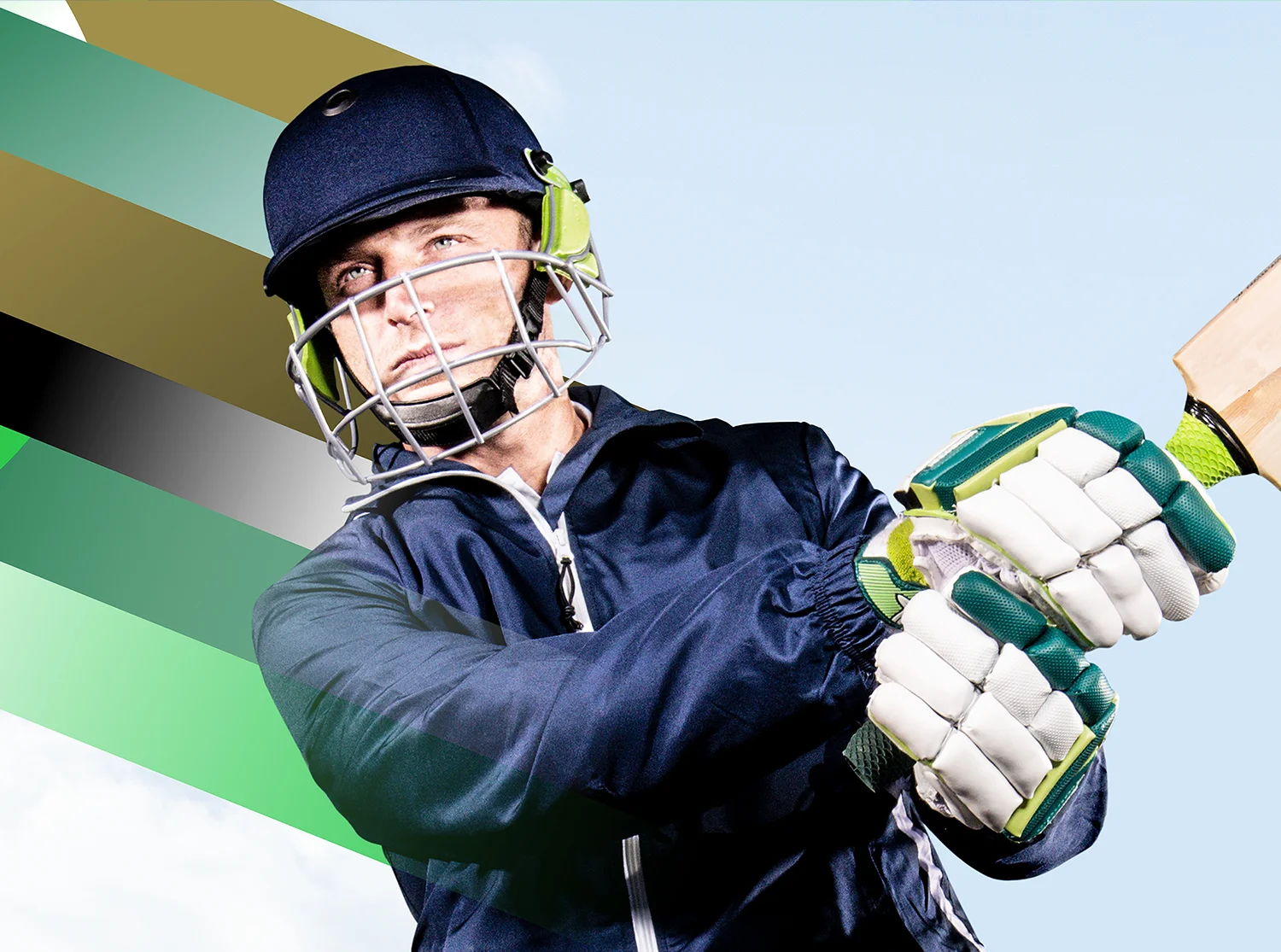
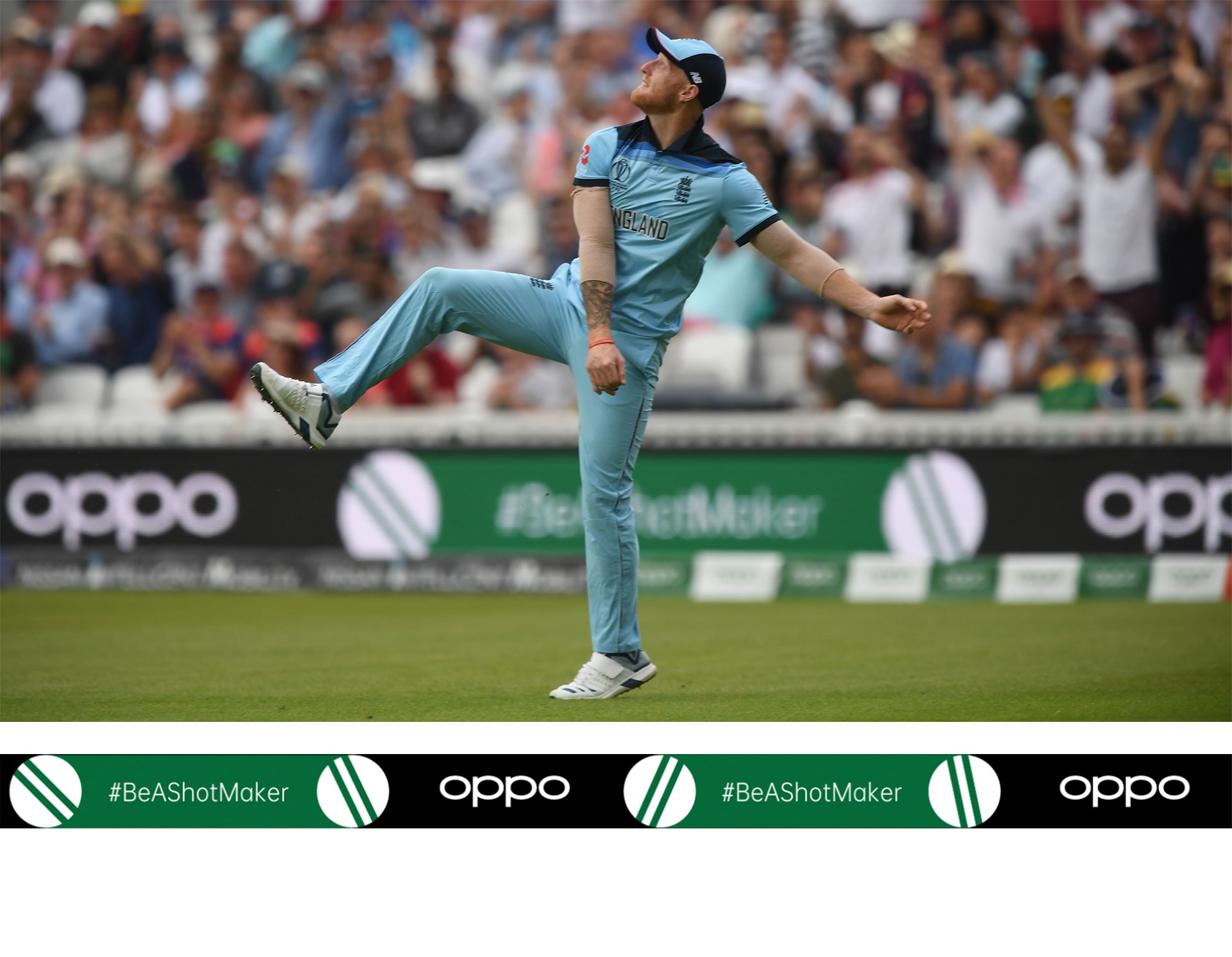
OPPO Cricket World Cup 2019
OPPO : CRICKET WORLD CUP CAMPAIGN
OPPO Cricket World Cup 2019
OPPO : CRICKET WORLD CUP CAMPAIGN
CHALLENGE
Direct a team of designers, retouchers, artworkers and animators to create the event brand identity for OPPO’s Cricket World Cup sponsorship.
SOLUTION
Inspired by 60s/70s British bold graphic design, we created a fun and stand-out identity which celebrated the game of cricket and its heritage.
EXECUTION
Design Director - From brief to final artwork
Full event branding
CHECK IT OUT


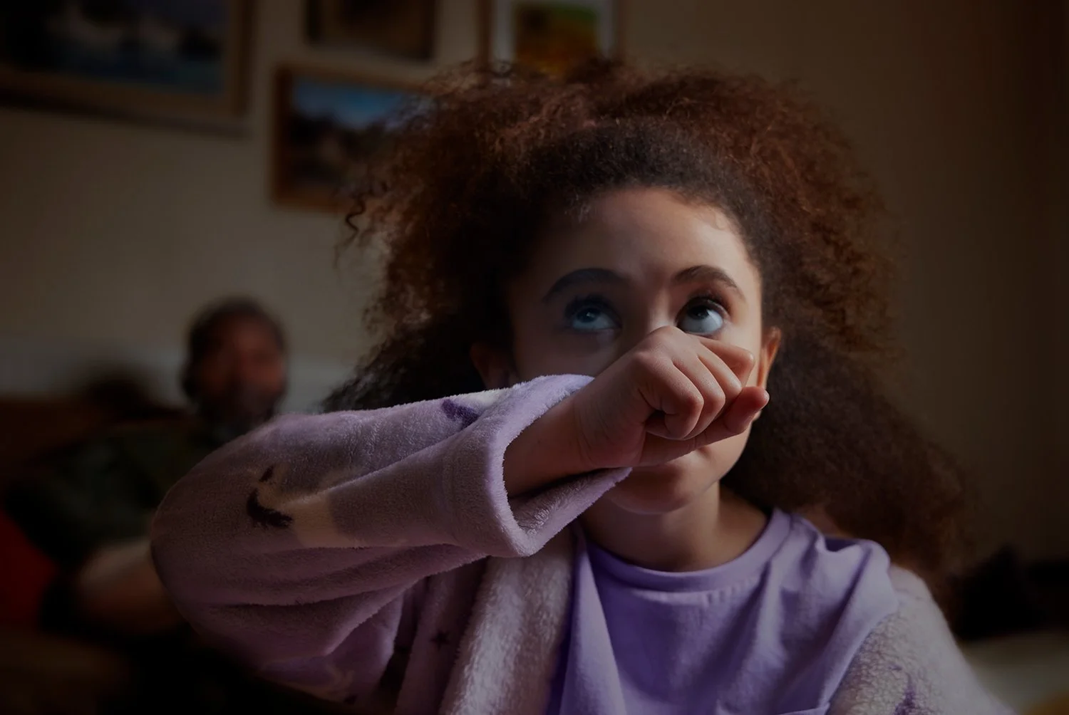
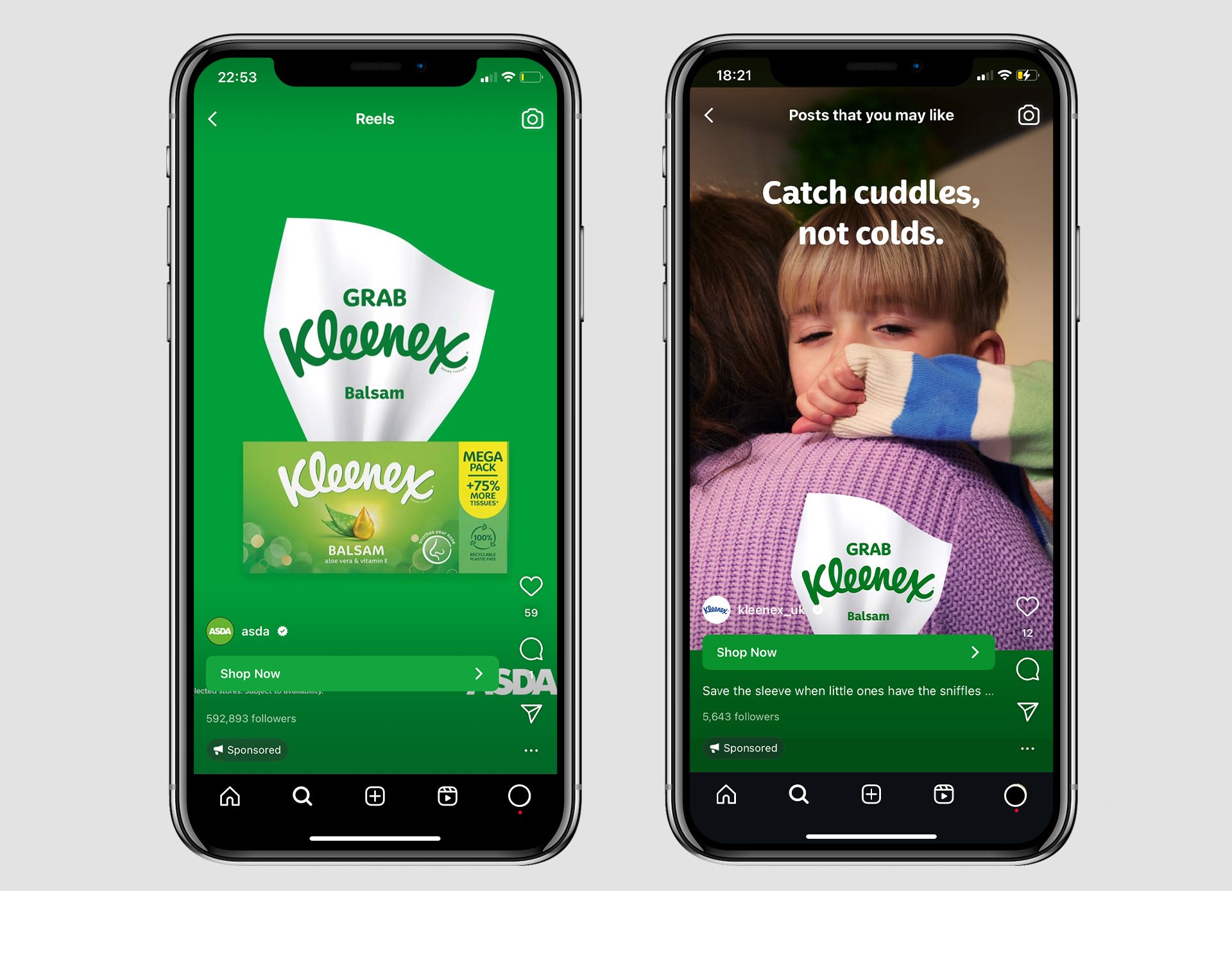
Kleenex
GRAB KLEENEX : BRAND REPOSITION & CAMPAIGN
Kleenex
GRAB KLEENEX : BRAND REPOSITION & CAMPAIGN
CHALLENGE
Reposition Kleenex as a real, authentic brand.
SOLUTION
Being brave means reflecting life in all its raw and imperfect glory, it means embracing the moments of vulnerability that other brands shy away from and always being honest about the role we play in people’s lives. Kleenex is now a brand that is snot (pun intended) afraid to show how the tissues are really being used by its consumers.
Kleenex is synonymous with tissues. To stand out in a busy market Kleenex now owns the tissue shape. The new tissue graphic is a shape that reinforces existing memory structures.
EXECUTION
Lead Designer – From brief to roll out
Full brand refresh including guidelines
CHECK IT OUT
Kleenex – Save the sleeve
Kleenex – Save the sleeve
Kleenex – Save the sleeve


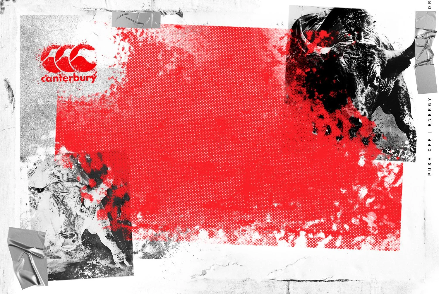
Canterbury: Stampede
CANTERBURY : STAMPEDE CAMPAIGN
Canterbury: Stampede
CANTERBURY : STAMPEDE CAMPAIGN
CHALLENGE
Create an exciting new campaign visual style for the release of Canterbury’s new rugby boot ‘Stampede’.
SOLUTION
When everything is equal, when two packs of highly drilled, disciplined, elite level forwards come together, they cancel each other out and it becomes an attritional trench war over the gainline. Phase after phase of drilled technique, recycle, reorganize, recycle. Rinse and Repeat. Boring. That’s what we want to revolutionize. When everything is ordered. We need to disrupt the routine.
The campaign visual was created with chaotic design that feels like you’re in the depths of a ruck or maul, locked in with engaging power.
EXECUTION
Lead Designer - From brief to artwork
CHECK IT OUT


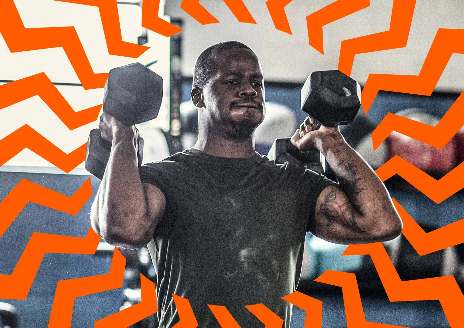
Fhiit Club 2
FHIIT CLUB : BRAND IDENTITY
Fhiit Club 2
FHIIT CLUB : BRAND IDENTITY
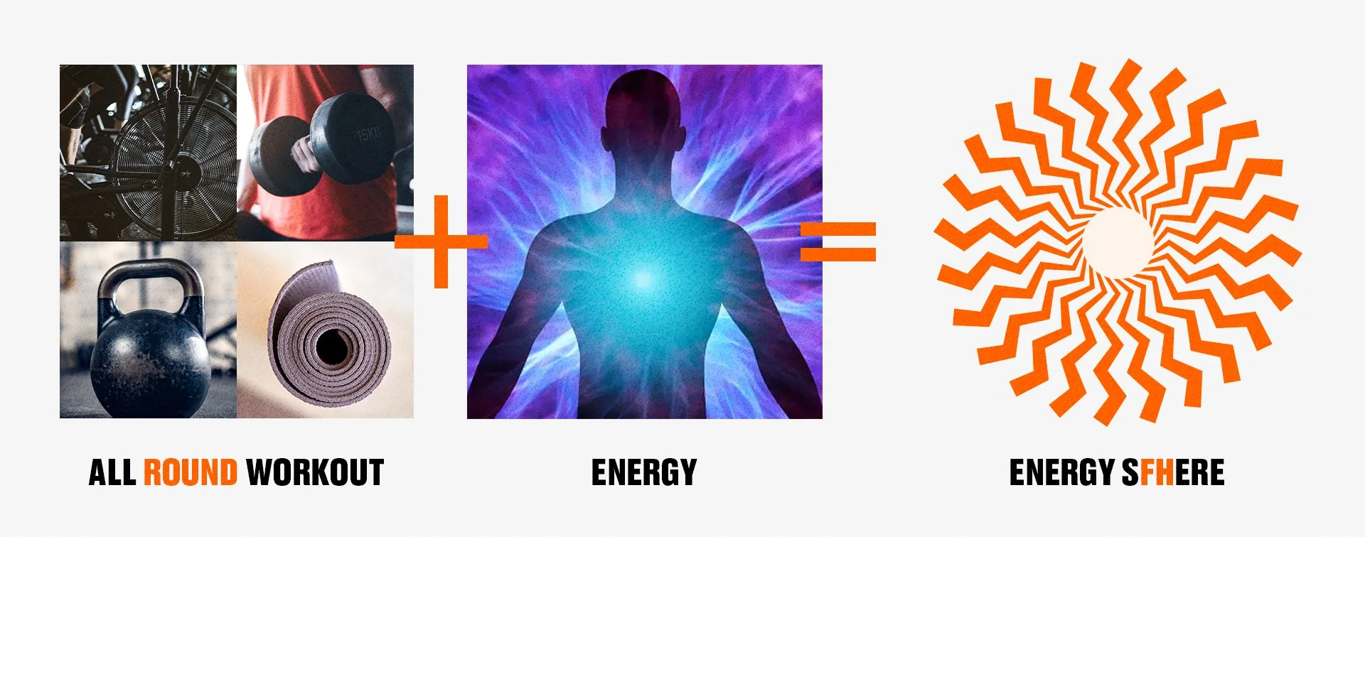
CHALLENGE
Create a fun and dynamic new identity for Fhiit Club.
SOLUTION
Run by a couple of very energetic trainers, Fhiit Club is a Hiit studio that offers a range of classes for an all round workout. The identity was crafted from the very unique energy that comes from the community and the all ‘Round’ aspect of the workouts offered.
EXECUTION
Design Director - From brief to rollout
Full rebrand
CHECK IT OUT


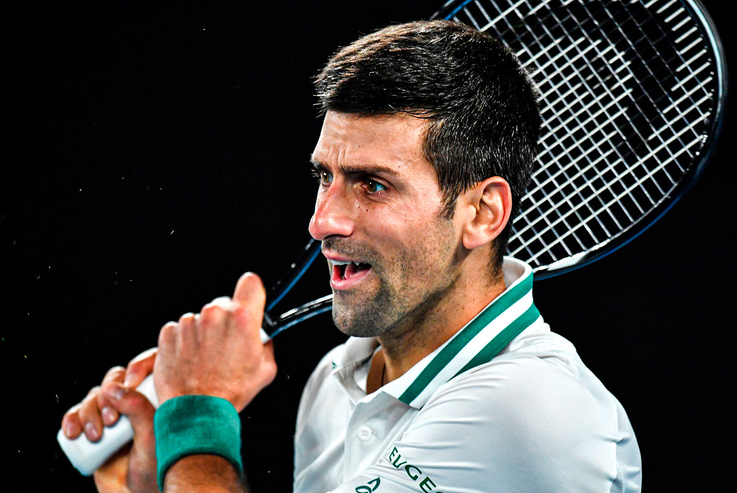
ATP Tour
ATP TOUR : SOCIAL MEDIA DESIGN
ATP Tour
ATP TOUR : SOCIAL MEDIA DESIGN
CHALLENGE, SOLUTION & EXECUTION
Create engaging and stand-out content across all social and digital channels for ATP Tour.
CHECK IT OUT


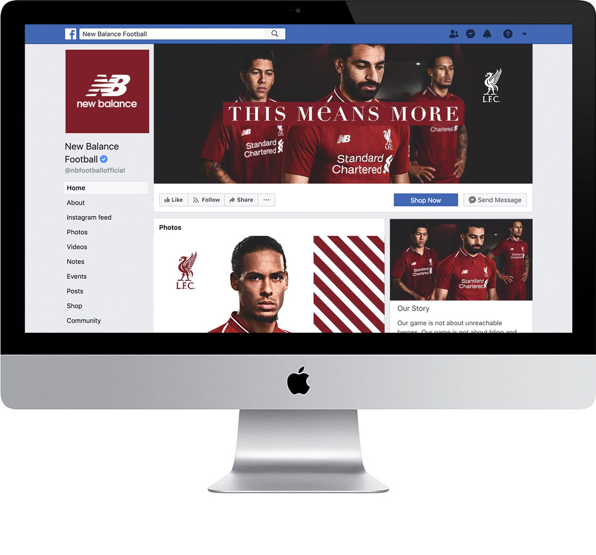
New Balance: Kit Release 2018/19
NEW BALANCE : KIT RELEASE CAMPAIGN
New Balance: Kit Release 2018/19
NEW BALANCE : KIT RELEASE CAMPAIGN
CHALLENGE
Create a stand out campaign for the New Balance football kit release.
SOLUTION
The campaign captures the focus and intensity felt leading up to every game. The graphic devices were created from the patterns from each kit.
EXECUTION
Lead Designer & Art Director
Print & digital key visuals
Full social media role out


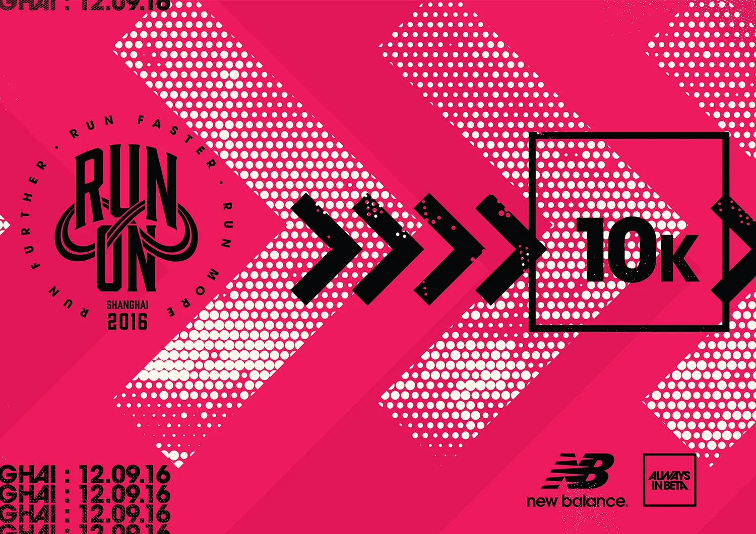
New Balance: Run On
NEW BALANCE : RUN ON EVENT IDENTITY
New Balance: Run On
NEW BALANCE : RUN ON EVENT IDENTITY
CHALLENGE
Create a modernised rebrand for New Balance’s running event ‘RUN ON’, which is a 5k/10k running event held in various Asian cities.
SOLUTION
The rebrand was created to encourage the runner to ‘RUN ON’ passed their PB (personal best) with a strong and simple design. The chevrons become the events symbol and are applied in many different styles and colours, which would then change to give each city its own identity within the brand.
EXECUTION
Lead Designer & Art Director – From brief to final artwork
Full rebrand
CHECK IT OUT


New Balance: 247
NEW BALANCE : 247 CAMPAIGN
New Balance: 247
NEW BALANCE : 247 CAMPAIGN
CHALLENGE
Create an exciting worldwide campaign for New Balance’s 247 sneaker.
SOLUTION
Shot in Shanghai, New York and London, ’Life in 247’ was created to show the versatility of the 247.
EXECUTION
Lead Designer & Art Director – From brief to final artwork
Print & digital key visuals
Full social media role out
CHECK IT OUT
CLICK FOR LUX VIDEO
CLICK FOR SPORT VIDEO
CLICK FOR CLASSIC VIDEO


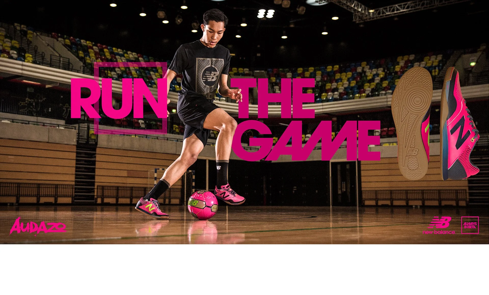
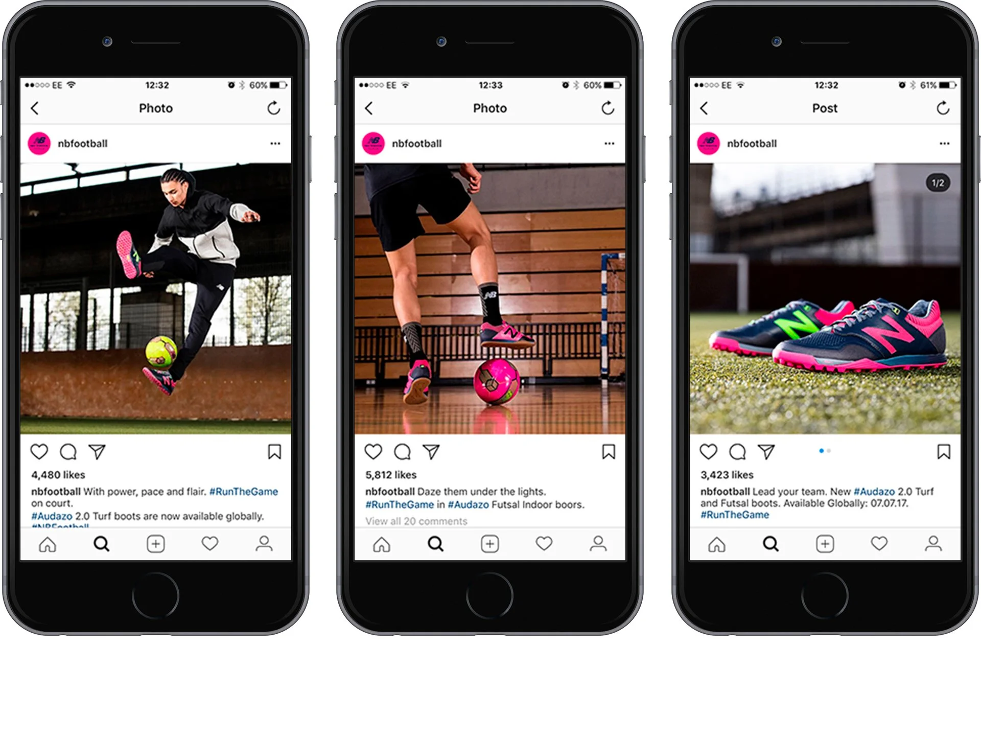
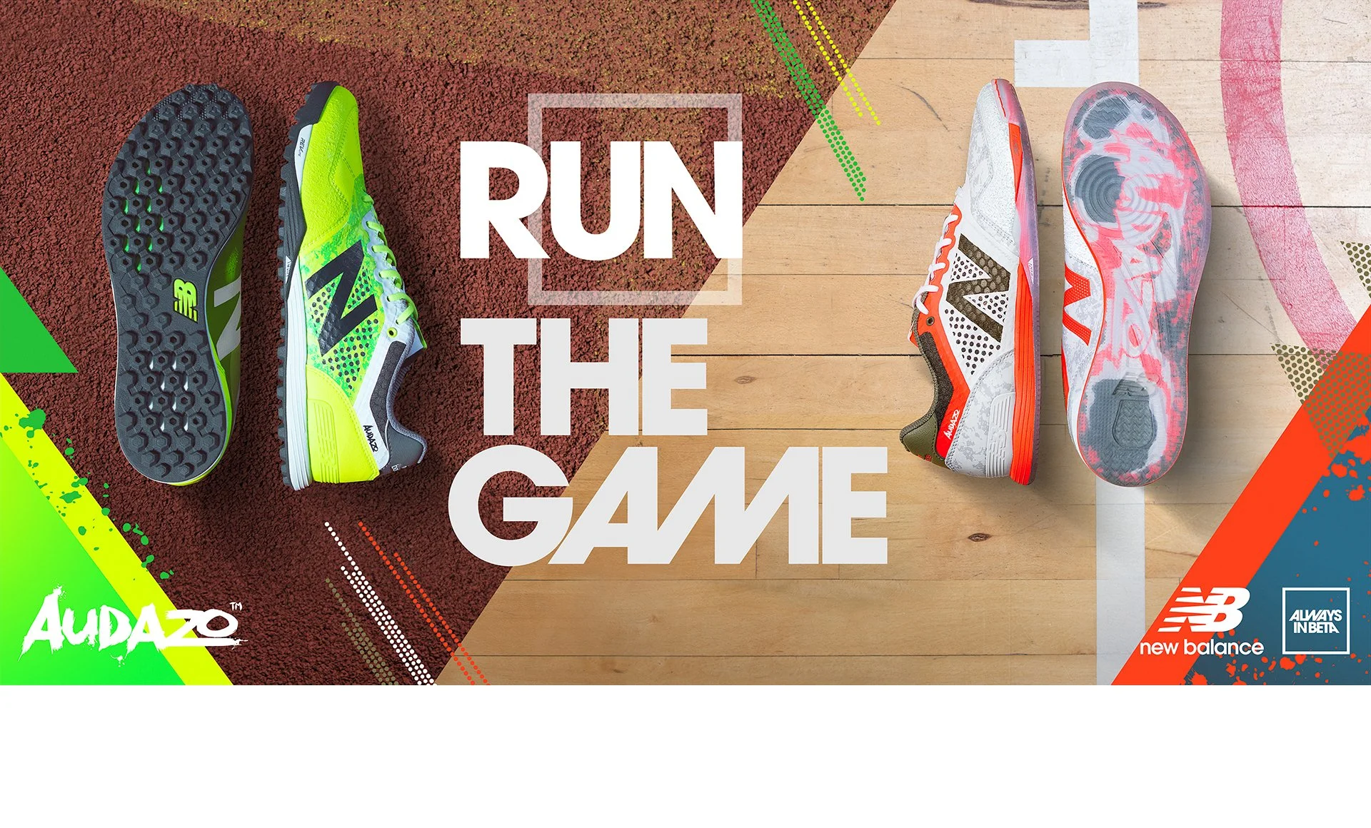
New Balance: Audazo
NEW BALANCE : AUDAZO CAMPAIGN
New Balance: Audazo
NEW BALANCE : AUDAZO CAMPAIGN
CHALLENGE
Create an exciting worldwide campaign to showcase New Balance Football’s Futsal and Small Sided footwear.
SOLUTION
The aim of the campaign was to show real intense action from the New Balance athlete, displaying the full capability of the New Balance footwear during play.
EXECUTION
Lead Designer & Art Director – From brief to final artwork
Print & digital key visuals
Full social media role out
Photo shoot direction
CHECK IT OUT


Hyde Park Winter Wonderland
HYDE PARK WINTER WONDERLAND : CAMPAIGN
Hyde Park Winter Wonderland
HYDE PARK WINTER WONDERLAND : CAMPAIGN
CHALLENGE
Create a new festive campaign for Hyde Park Winter Wonderland.
SOLUTION
Two campaign concepts bursting with festive fun and christmas spirit.
EXECUTION
Design Director – From brief to final artwork
Strategic thinking
CONCEPT 1
At Christmas everyone needs a place to escape to. For the first concept I created a magical fantasy land which grew from the grass and trees of Hyde Park. The story was told through its wacky collage style visuals.
CHECK IT OUT


CONCEPT 2
Bringing out the unmistakable feeling Winter Wonderland creates in every one who visits. Concept 2 centers its story around the imaginations of the Winter Wonderland visitors, this is shown through the fun illustrations over photography.
CHECK IT OUT


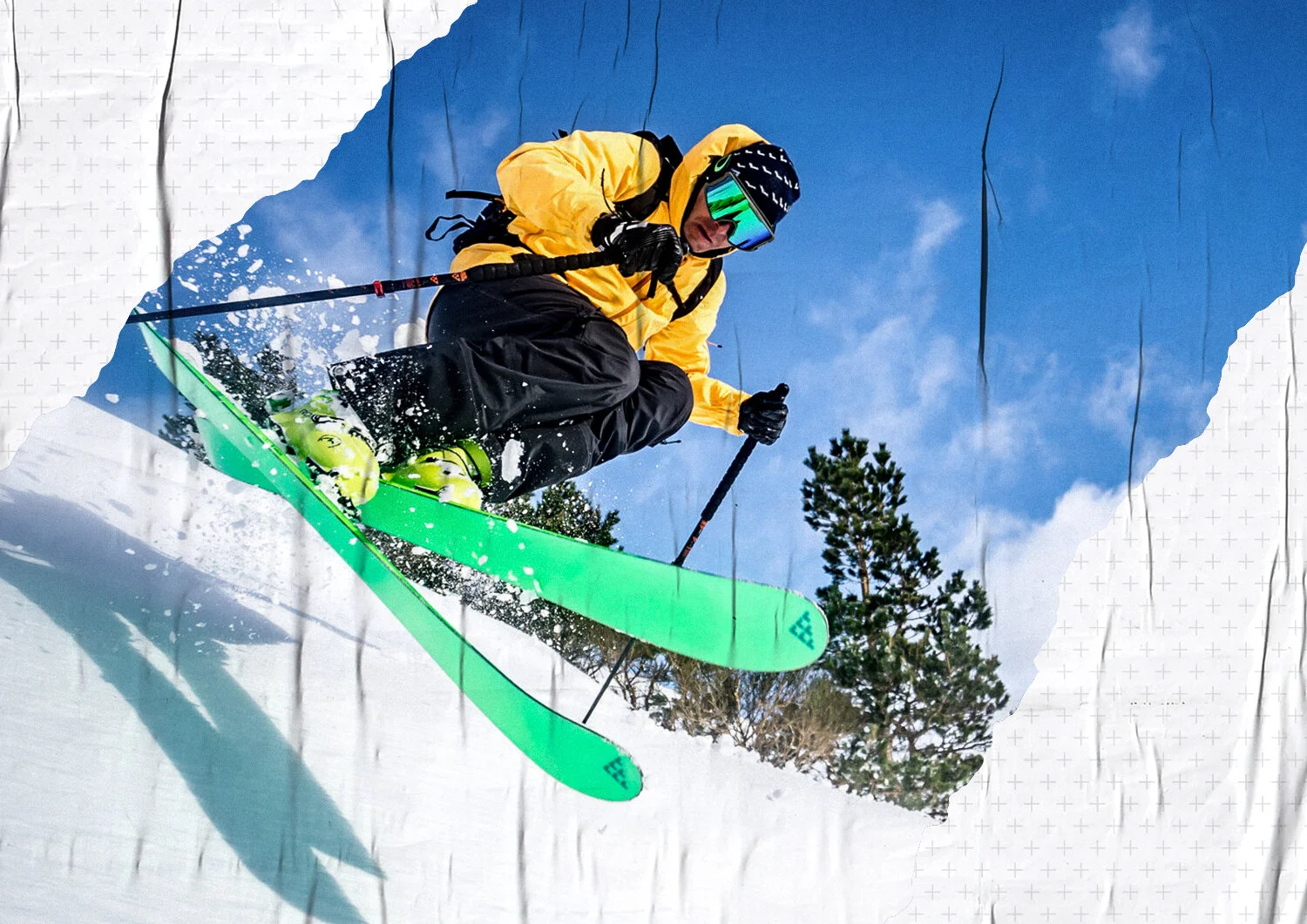
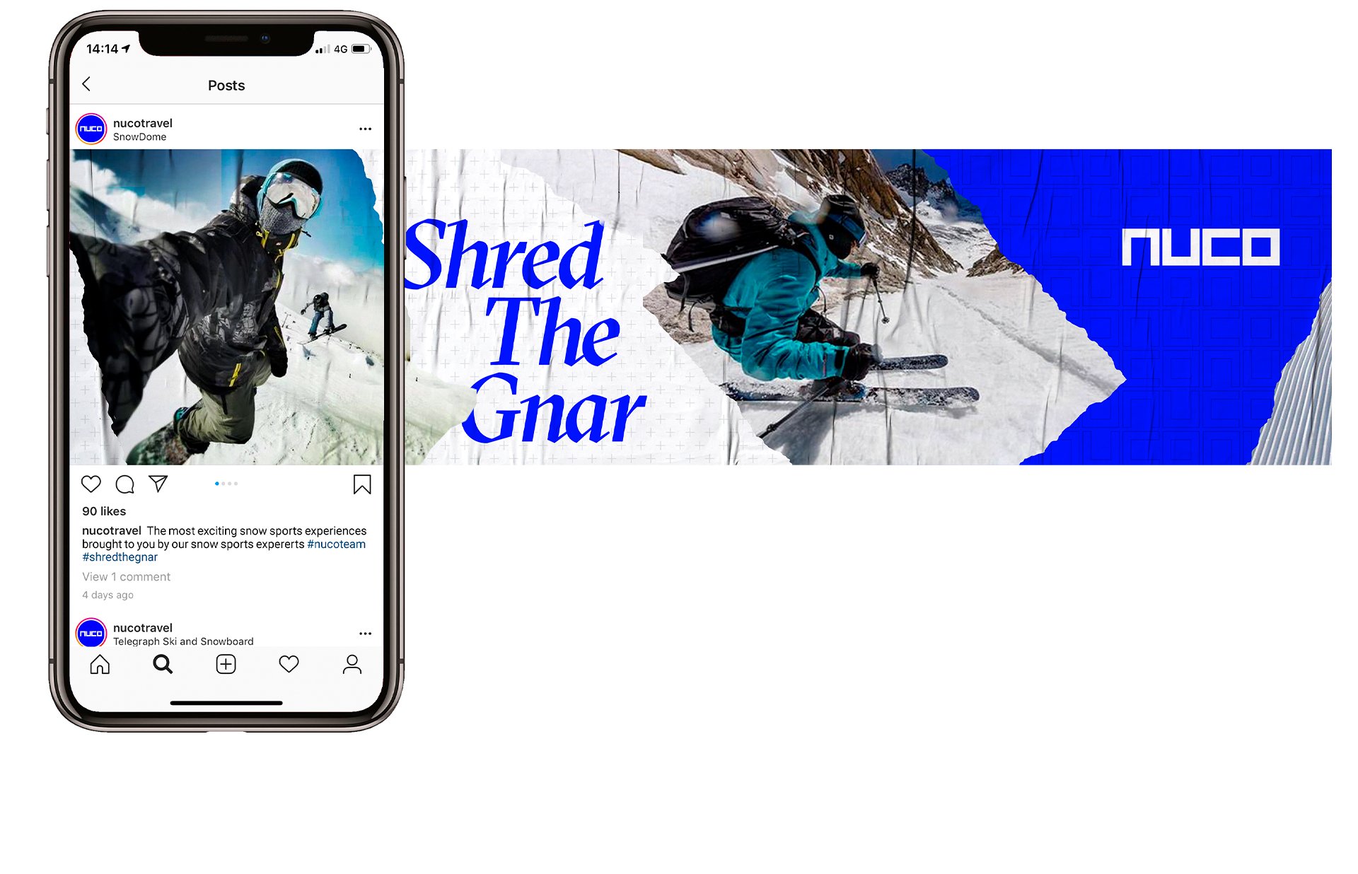
NUCO
NUCO : BRAND IDENTITY
NUCO
NUCO : BRAND IDENTITY
CHALLENGE
Create a digital brand refresh for travel brand NUCO.
SOLUTION
NUCO provide their travellers an action packed holiday powered by the knowledge and experience of the NUCO snow team. The brand refresh has been built out of an authentic feeling which focuses purely on snow sport.
EXECUTION
Design Director
Full branding
Website
Social media application
Apparel
CHECK IT OUT


Run To The Beat
RUN TO THE BEAT BY BANG & OLUFSEN : EVENT IDENTITY
Run To The Beat
RUN TO THE BEAT BY BANG & OLUFSEN : EVENT IDENTITY
CHALLENGE
Create a modernised rebrand for Run To The Beat Sponsored by Bang & Olufsen. RTTB is a half marathon event taking its name from the use of music along the route.
SOLUTION
RTTB has been inspired by the user interface of digital music apps and players. From the format and structure of the artwork through to the detailing of the player controls, the brand has been developed to connect the worlds of running and music in a familiar environment.
EXECUTION
Design Director – From brief to final artwork
Full rebrand
CHECK IT OUT


The Hoods
THE HOODS : BRAND IDENTITY
The Hoods
THE HOODS : BRAND IDENTITY
CHALLENGE
Create a new brand identity for Nottingham Basketball team 'The Nottingham Hoods'.
SOLUTION
Building a brand which can be related to the city of Nottingham, the identity was designed on one of their most iconic figures - Robin Hood.
EXECUTION
Lead Designer
Full brand identity
AWARDS
The identity won a Bronze Cream Award and was also nominated for a Roses Design Award.
CLICK FOR ROSES DESIGN AWARDS
The mark was so well received by the client that he tattooed it on his arm!!!
CLICK FOR THE VIDEO


